Balance Studio
[Holistic Trio]
Shahad was on the cusp of expanding Balance Studio's horizons. Originally, the brand was set up to support Shahad’s freelancing pilates business but she was ready to open her own studio and needed a brand that supported her with that growth.
The Balance brand needed to feel like a place of refuge for people to come to and shed the worries of daily life but also encompass a hint of luxury. The hexagonal shape that is typically associated with the beehive, is rooted in Greek and Roman symbolism which represents an ideal society and prosperity. A big part of the Balance concept is building a community, an ideal society of like-minded individuals coming together in unity to build a utopian dream. The colour palette; the orange and clean white echo both the premium vibe and the calming nature of the studio.
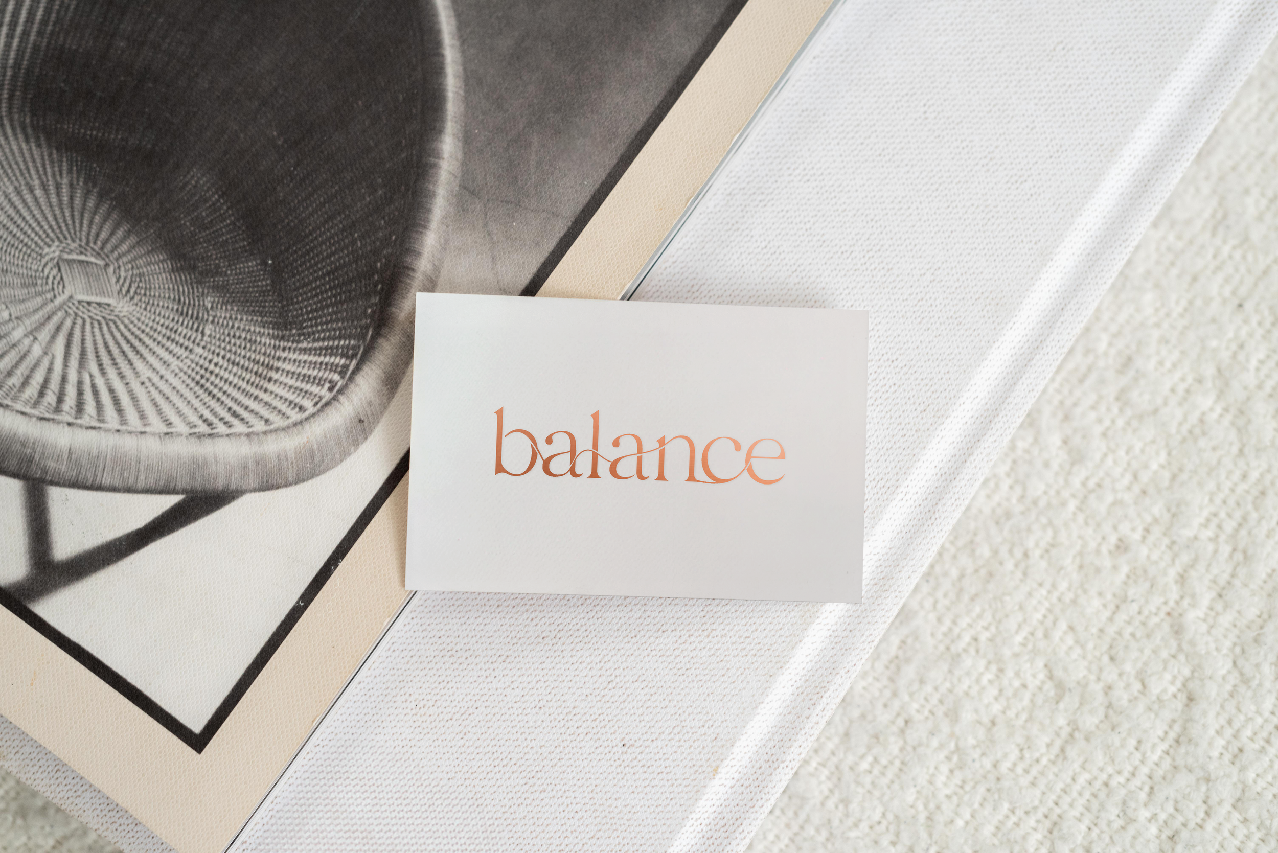
The company has roots in different methods of fitness, all over the world so the brand needed to encompass this within its visual identity. The main element of the branding sees a calming flow conjoining the letters in the word ‘Balance’ recreating the flow-like state that the exercise style is about.